Ko & Rossen, Chapter 9: Creating Courseware and Using Web 2.0 Tools ↓
There is a section in the chapter titled “Problems that students typically encounter” that, I think is important (but all chapters in this book are equally important in my opinion): some icons on a course website sometimes mean the same because they are too general as stated in that chapter such as “Main course or Notes or Information,” etc. Therefore what seems obvious to the teacher might not to the student. So once again, the focus has to be on being more specific by choosing the right terminology.
Another important chapter is about preparing beforehand the students for an online course: setting up a short online quiz seems to be a good way to introduce the students about what an online course is supposed to be. And on the teacher’s side, it is crucial to balance the workload when you have many students spread over a few online classes.
I see the workload and time management as two big priorities for the teacher: learning how to manage effectively many students and choosing the right online tools to make an online course excellent and attractive at the same time.
 I took more than one look at Prezi, and it is definitely a good visual presentation application. Most of my students choose Prezi rather than Power Point but I always give them the choice so they have both options for their oral presentations in class. I like the “flash” feeling with Prezi. It somewhat feels more professional to look at it and it focuses on the important point in a more effective way than Power Point being more static.
Short screencast with Screen-o-Matic: my mind map + via YouTube below =
→ Below, you can play with it too with your mouse:

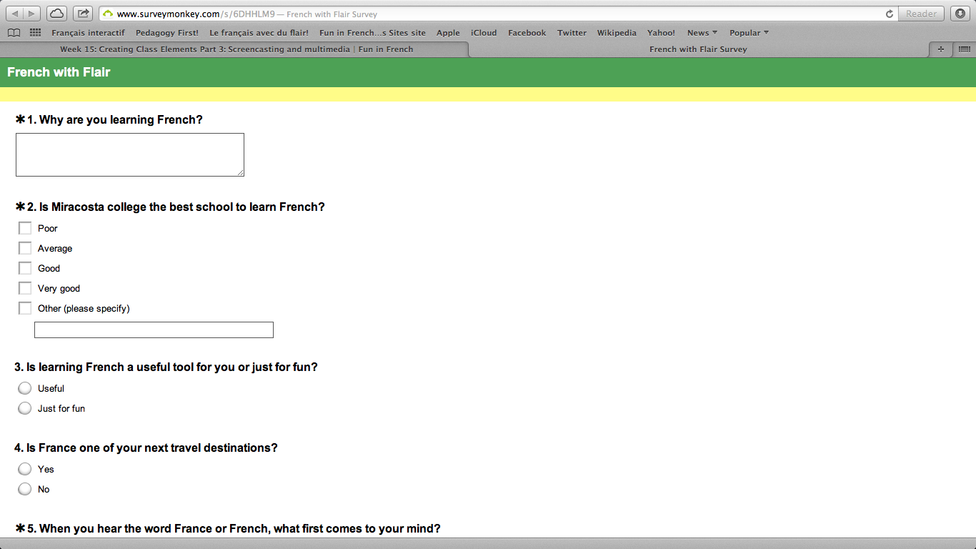
Short poll with SurveyMonkey : http://www.surveymonkey.com/s/6DHHLM


