Hi all,
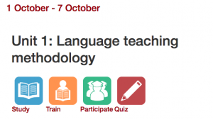
I have to start by telling a story about one of the biggest challenges I have had teaching online thus far in my career. During my second year of teaching online coursework, I was notified that I had a student in my online class that was blind. I had a lot of support available to me to help this student such as getting him Microsoft Word Documents of all of our readings from our text-book and additional readings (his screen reader could only read from black and white MS Word Documents). I eventually solved a huge problem that was preventing him from joining our online discussion forums (I have pictures of modules for students to click on and while the picture was linked the text was not linked and so his screen reader could not pick up the link from the image. Screen readers need to read a text that is linked in order to pick it up and announce to the listener that there is indeed a link.) I e-mailed him MS Word files for the quizzes that were on our LMS Moodle.
Each week I had to carefully review all of my materials and make sure that he had access to everything in a format where he could listen to the lecture, have the reading in a Microsoft Word File, and access other student’s discussion forum responses in a timely manner in order to respond to them.
I e-mailed this student almost every day in the first 2 weeks of the course. An e-mail was one of the best sources of communication for us at that time since the student reported to me that he was having trouble with a phone line and Internet access at the time. I believe by week 5-6 the student dropped the course. I’d like to say that I did everything that I could have, but I’m sure I could have done more.
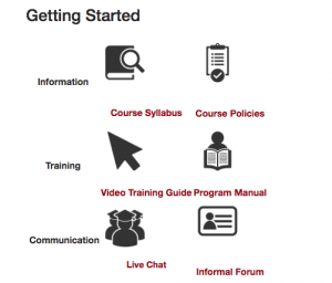
Long story short, that student got me thinking about how my online courses in English composition would need to get more simplistic looking in nature so that students are not navigating through modules with long lists of files, etc. I currently use texts from a variety of resources and books and the documents can really start to clutter each module. I have a very different looking online course in my teacher education program with Moodle, and each module has just four images to click on with tasks for each week. For my two sections of English 100 this semester, I definitely need to find a way to get rid of all the clutter. I do like how Curry has this course set up with just four pages on the left-hand side, and all of the materials needed for each with stored within the discussion post. What a great way to de-clutter any course in an LMS! Someone with a screen-reader would be able to navigate Curry’s course much more quickly than mine right now!


Ok, my response is getting long. I just want to talk about one more aspect from Wood’s presentation that I have been working on in my ENGL 100 courses this semester. Wood’s point about racially salient images was something that I have typically stayed away from. However, I have just recently noticed how many different racially and equitable images and materials I am utilizing in my coursework. To name a few, I use a short activity from Borcher’s Rhetorical Theory: An Introduction where students analyze part of Christopher Reeves speech at the 1996 Democratic National Convention. I have used this speech to help students get more comfortable with the task of analyzing the rhetorical situation in many different workshops and courses I have taught. But I was hesitant this semester to use it because I have one student who uses a wheelchair in my class. I wasn’t sure how this student would react to the short clip of the speech that we watched and the entire speech, which argued for more financial support for disabilities. Anyway, everything went over smoothly. It is always interesting to see who knows Christopher Reeves among my students, and who has ever listened to national convention speeches.
I also just recently brought in the Nike ad featuring Colin Kaepernick and demonstrated my own rhetorical analysis of the ad for students before they worked on a practice activity with their own ads they brought in. Curry, since we were talking about that advertisement during the Accelerated Learning Program Conference a few weeks ago you sparked my interest! Racially salient images are more important than ever to utilize in our classes.
I’ll end here with one final anecdote. I recently had a student who came to me and said something like, “I just don’t feel like I am smart enough to be here. I’m ______ (race), and I have so much fear and anxiety every time I open my mouth in class. I just get so nervous when I have to talk to other people in class.” This student of mine has been having tremendous attendance issues to say the least, but I have been accommodating him after our chat this semester about his anxiety. What is so devastating to me is that I had no idea that this student was feeling so much anxiety about his race in the classroom. I have a very diverse class. He is in my ENGL 100 ML (Multilingual) section this semester. I never would have expected one of my students to come to me and say something to me about their race making them feel inferior to other students. I am so glad that he did come to me, and I was able to help set up a plan with him so that he is feeling more comfortable in the class. This recent experience has taught me how important it is for me to address my whiteness among my students, and how to talk about inadequacies that students might be feeling in my classes so that they feel more comfortable reaching out for support to me or other resources on campus.

Pingback: The KonMari Method as a Guiding Metaphor for My Dream Online Writing Course | WritingwithMachines